Frank Miller's Drawing Style: The Visual Language That Redefined Comics
Frank Miller's Drawing Style: The Visual Language That Redefined Comics
Frank Miller is one of the most influential artists in the history of sequential art. His work on Batman: The Dark Knight Returns (1986), Daredevil, Sin City, and 300 didn't just tell great stories — it introduced a visual grammar so distinctive that it permanently altered how mainstream comics looked, felt, and were read. His drawing style is immediately recognizable: ink-black shadows swallowing entire figures, stark geometric compositions, exaggerated anatomy that bends reality in service of emotion, and a cinematic brutality that feels carved rather than drawn.
This article breaks down the key elements that define Frank Miller's artistic approach and why it still resonates so powerfully decades later.
1. High-Contrast Black and White: Ink as Architecture
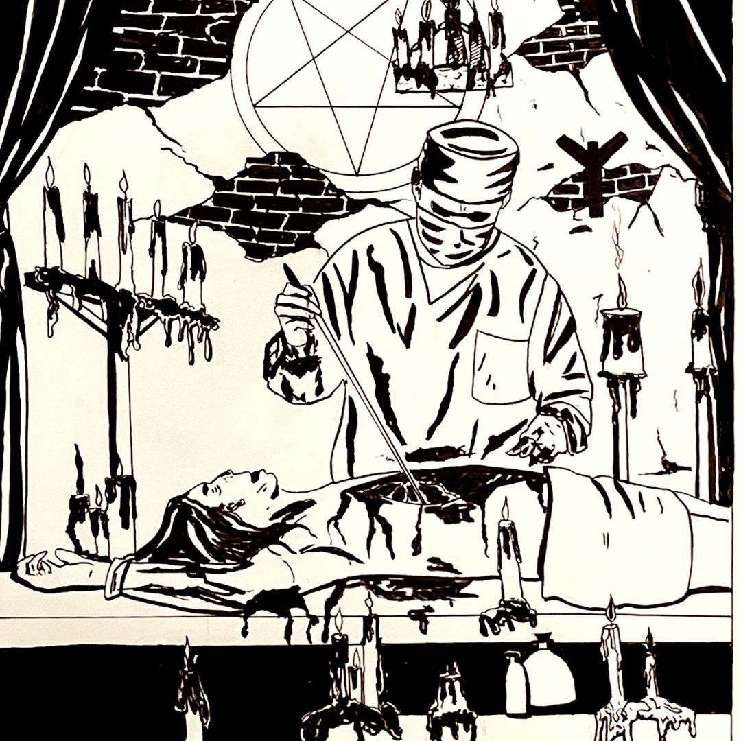
The single most identifiable feature of Miller's mature style — most fully realized in Sin City — is his radical use of black and white with near-zero gray. Where most comic artists use midtones to model form and suggest light sources, Miller treats black ink as a structural material. Shadows are not cast — they consume.
Large areas of solid black devour backgrounds, clothing, and even faces, leaving only fragments of white to define a cheekbone, a jaw line, or the glint of a gun barrel. This approach owes a clear debt to classic Hollywood film noir cinematography — the chiaroscuro lighting of directors like Carol Reed and Otto Preminger, where moral ambiguity is visualized through shadow.
In practical terms, this means:
- Spot blacks placed aggressively and early in the composition, not added as an afterthought
- Silhouetting figures rather than fully rendering them — the outline does the storytelling
- Negative space used actively — white is as deliberate a choice as black
The result is imagery that reads instantly, even at small sizes, and carries enormous emotional weight without requiring color.
2. Expressionist Anatomy: Bodies That Communicate Before They Act
Miller's figures are rarely anatomically "correct" in the classical sense, and that's entirely intentional. He draws in a tradition closer to German Expressionism and Japanese manga than to the idealized superhero physiques that dominated American comics through the Silver Age.
His characters are often:
- Barrel-chested and squat, with heads that seem too large or too small for their bodies
- Elongated and angular when a scene demands menace or tension
- Hulking and asymmetrical — especially his interpretation of Batman, reimagined in The Dark Knight Returns as a bruised, aging monument rather than an elegant athlete
Muscles are implied through shadow and outline rather than rendered in anatomical detail. A fist raised in violence doesn't need every tendon visible — what it needs is weight, and Miller achieves that through posture, line direction, and the compression of the figure against the panel frame.
This expressionism means the body becomes a direct emotional signal. A character's fear, rage, or exhaustion is legible in the silhouette alone.
3. Cinematic Panel Composition and Unconventional Page Layouts
Miller approaches the comic page the way a film director approaches a storyboard — with a deep understanding of framing, pacing, and the emotional effect of camera angles. He was heavily influenced by Japanese manga (particularly the work of Goseki Kojima, whose Lone Wolf and Cub he championed in the American market) and incorporated its cinematic economy into his own work.
Key compositional choices in Miller's work include:
- Extreme close-ups on eyes, hands, or mouths — fragments of the body that carry the emotional load of a scene
- Worm's-eye and bird's-eye views used to establish power dynamics between characters
- Thin, horizontal "widescreen" panels that evoke the aspect ratio of film — common in Sin City and 300
- Juxtaposing large, silent panels with dense, tight sequences to control the reader's pacing
In The Dark Knight Returns, Miller breaks the traditional grid entirely with sequences that stack panels of radically different sizes to create a rhythm that feels more like editing than drawing. The page itself becomes a compositional object.
4. Line Weight and Ink Technique
Miller's line work is bold, decisive, and unapologetically rough. Where artists like Neal Adams or John Byrne favored smooth, controlled line work that imitated illustration conventions, Miller's inking is aggressive — thick outlines that taper sharply, hatching used sparingly and structurally, and contour lines that prioritize gesture over precision.
In his earlier work (Daredevil, Ronin), Miller used finer, more detailed line work that showed his classical training. But as his style matured, he stripped it back. By Sin City, line nearly disappears in favor of pure shape — areas of solid ink defined by their edges rather than outlined with a pen stroke.
This shift reflects a deeper philosophy: ink is not description, it is declaration. He is not recording what something looks like. He is asserting what it means.
5. Typography and Lettering as Visual Elements
Miller's visual approach extends to the text on the page. His caption boxes, often in a narrow rectangular format with stark white text on black, are as carefully placed as any drawn element. They function as a visual rhythm device — their size, placement, and density either slowing the reader down or accelerating them through a page.
In Sin City, Marv's first-person narration captions are deliberately terse and punchy — short declarative sentences that mirror the visual rhythm of the staccato imagery. The text isn't separate from the art; it's integrated into the composition.
6. The Influence of Film Noir and Hard-Boiled Fiction
To understand Miller's visual style is to understand his source material. He has spoken openly about his debt to:
- Raymond Chandler and Dashiell Hammett — the hard-boiled prose voice that shapes his narrative captions
- Film noir cinematography — the deep shadows, rain-slicked streets, and morally compromised protagonists
- Akira Kurosawa's samurai films — the choreography of violence, the stoic code, the weight of consequence
- Will Eisner's The Spirit — an early influence whose expressionist urban environments and inventive page design laid groundwork Miller built upon
These influences don't just shape his subject matter. They shape the visual decisions at every level — the angle of a shot, the depth of a shadow, the rhythm of action across a page.
7. Color (When He Uses It): Selective and Strategic
While Miller's most iconic work is black-and-white, his use of color in projects like Sin City: The Hard Goodbye (in its colorized editions) and 300 (colored by Lynn Varley) demonstrates the same strategic thinking applied to palette.
In 300, Lynn Varley's colors are painterly and desaturated — ochres, burnt siennas, and dusty browns that evoke ancient fresco painting and bleached Mediterranean light. The color doesn't compete with Miller's line work; it amplifies it.
When color is used selectively in Sin City — a single red dress, yellow skin, blue eyes — it operates like a spotlight on a dark stage. The choice is never decorative. It is always narrative.
8. Frank Miller's Lasting Influence on Comics and Visual Media
Miller's drawing style didn't stay contained within comics. Its fingerprints are visible across:
- Hollywood superhero films — the gritty, desaturated visual palettes of Christopher Nolan's Batman trilogy owe a direct debt to The Dark Knight Returns
- Robert Rodriguez's 2005 film Sin City — shot almost entirely to replicate Miller's panel compositions, with Miller co-directing
- Zack Snyder's 300 (2007) — again, an attempt to translate Miller's page directly to screen
- A generation of comics artists — from David Aja to Sean Murphy, countless artists cite Miller as a foundational influence on their approach to ink and composition
Conclusion: A Style Built on Conviction
What makes Frank Miller's drawing style so enduring is not any single technique — it's the conviction behind every choice. Every shadow placed, every figure distorted, every panel cropped is in service of a singular emotional truth. He draws the way a good novelist writes: nothing is there by accident, and nothing is there just because it looks nice.
His work reminds artists at every level that style is not decoration. Style is argument. And Miller's argument — that comics can be as architecturally bold, as emotionally raw, and as cinematically sophisticated as any other storytelling medium — has been decisively proven on every page he's ever inked.